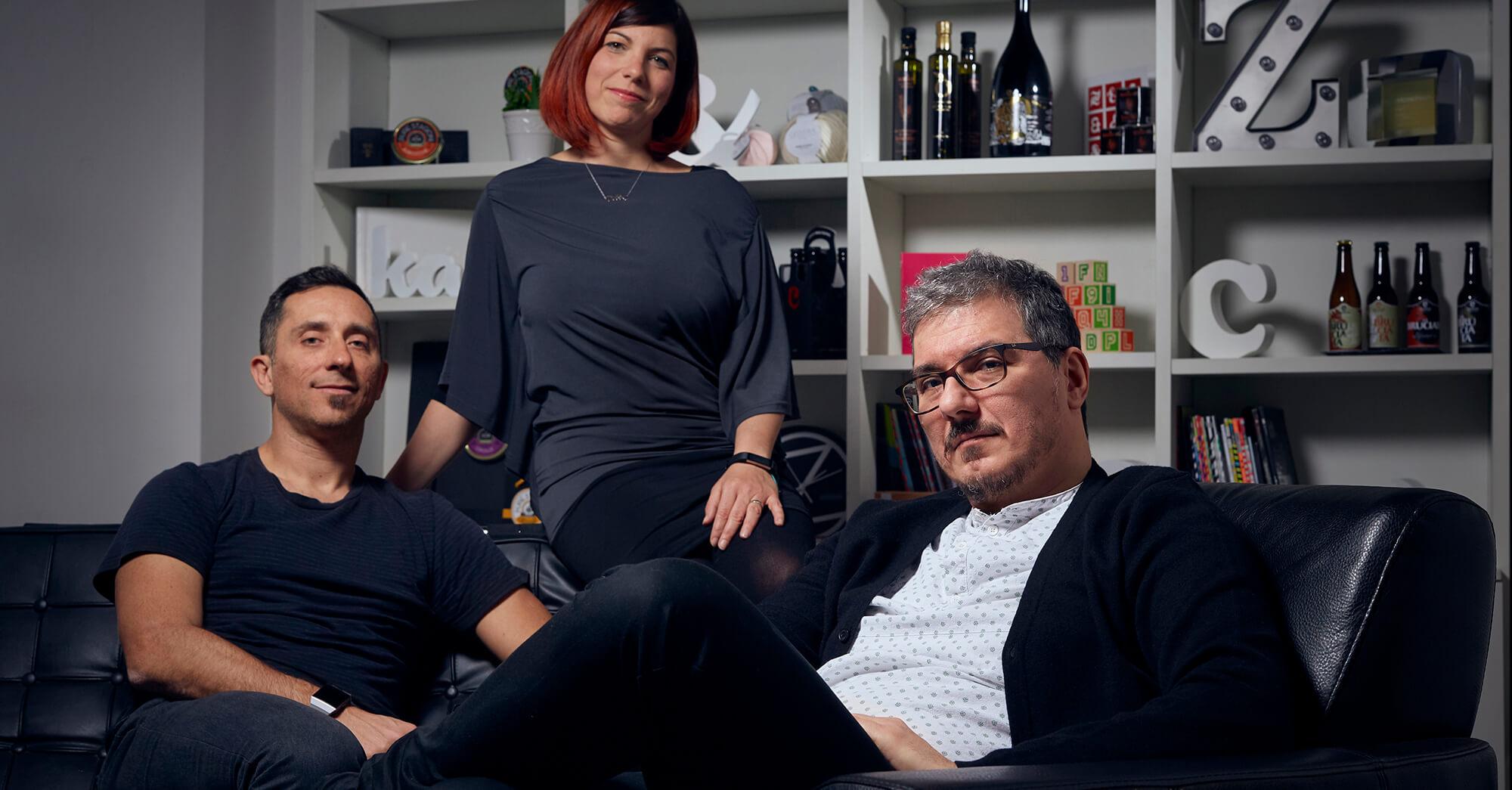
Zetafonts is an independent type foundry based in the heart of Florence, Italy, established in 2001 by Francesco Canovaro, Debora Manetti, and Cosimo Lorenzo Pancini.
Zetafonts: Letters from modern Italy
I read a wonderful story about your first experience with type. Can you share that story with us?
My love for type started when I found some Letraset rub-on transfers and their catalog in a shop. I didn’t know why exactly, but I was drawn to them. I liked to draw and liked letters. I particularly fell in love with Arnold Böcklin, a peculiar Art Nouveau typeface. When I was around 10 or 12 years old, I used to trace its letters and learn their shapes. This interest faded from my mind when I went to study architecture and worked as a graphic designer. But later, the memories came back when I started designing typefaces.
What’s the story behind your first typeface?
Francesco Canovaro, Debora Manetti, and I had started a design studio together and by 2001, we noticed how much we enjoyed branding jobs for which we got to modify typefaces. We had a basic type design program and started to provide clients with custom, simple typefaces for coordinated graphics and branding systems. Initially, it was more about the pleasure of creating branding. As we got more into it, we found ourselves increasingly drawn to type design. In the early 2000s, we were really inspired by typefaces from Emigre and designers like Jonathan Barnbrook. These influences seeped into our projects. Slowly, we realized the typefaces we created were growing in complexity. We started sharing them online as free, creative commons licensed, downloads, and people showed interest. We began studying more intensely because there was so much to learn. That’s how it all grew.
Zetafonts finely designs high quality retail typefaces and provides custom font design services for commercial and institutional clients worldwide.
Milligram strikes a delicate equilibrium between precise modernist ideals and the human warmth of old lead grotesques.
Since then, you’ve designed or been part of designing more than 50 typefaces.
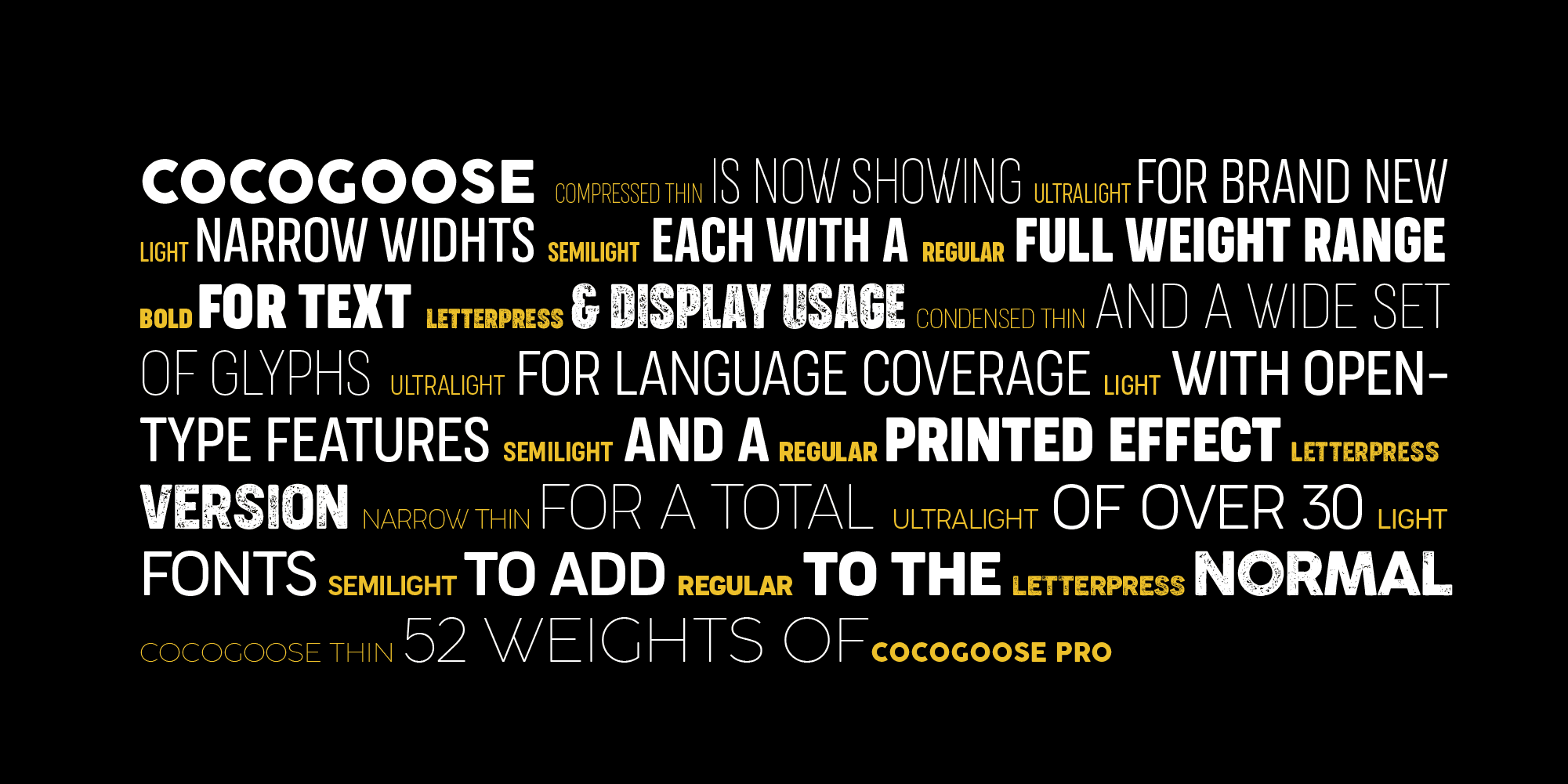
Yes, I can say we are quite prolific. We understood that rather than striving for never-ending perfection, we preferred to experiment enthusiastically with different styles. Our early typefaces were quite grungy and experimental. Gradually, we moved towards more robust designs. Currently, we have over one hundred typefaces, split between me and Francesco. The foundry has grown, especially with the addition of our lead type designer Andrea Tartarelli, and the latest member of our type design team, Mario De Libero.
Do you have any favorites among the many typefaces you've designed?
Well, we often find ourselves fond of the older ones, even if they are not commercially successful. For instance, last year we created Keratine, which won a TDC award. It’s a very experimental typeface. Another recent favorite is Artusi, which we put on Type Network because we really love its design. On the other hand, one of our most successful typefaces is Cocogoose, one of my earliest designs. It’s become a classic and is still widely used, which is always a pleasure to see. Another favorite is my grotesque face Milligram, also available on Type Network. It was a challenge to work on, adopting a slightly older, metal type feel, diverging from the more typical Akzidenz Grotesk style.
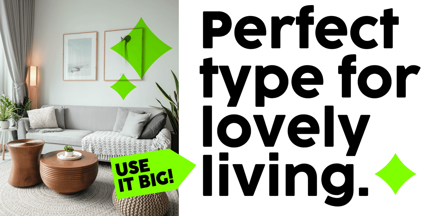
Cocogoose is influenced by vernacular sign painting and modernist geometric faces.
You studied architecture, which is both artistic and technical. Would you describe your type design process as more one or the other?
It’s a nice balance. We’re increasingly interested in the storytelling aspect of type design. You’re creating a technical tool, but people use it not only because it works technically, but also because they need an emotional connection with it. We believe sometimes the stories and little touches in a typeface can make it speak to the users. Also, when designing, you might need a certain mood or feeling, and when you create a typeface, we always try to embed some story into it, so it adds something to the projects in which it is used.
You work as a type designer, educator, and creative director. How do these roles interrelate for you?
I find it very intriguing because both Francesco and I are teachers. This dual role allows us to create typefaces that are technically sound, creatively interesting, and attuned to the trends and desires of designers. We believe in designing for our time, acknowledging timeless classics while also finding ways to encapsulate new values and aesthetics. Teaching and research are integral parts of our work because we see ourselves as part of the design community and our cultural scene. We strive for our work to be meaningful to those in the field.
You mentioned community. Can you tell me about where you live, and do you feel it’s conducive to your creativity? Is there a good design community there?
We live in Florence, Italy, a beautiful city rich in art history. However, today’s design scene here is more about preserving the past rather than contemporary creativity. While the history is inspiring, we draw more inspiration from the internet and places we visit, like Japan, the United States, and Germany. Our relationship with Florence combines appreciation for historical beauty and a desire to translate it into something contemporary. Our community, in essence, is global, catering to a worldwide market. We do have great designer friends in Italy who inspire us, but our work is a hybrid of local soul and international influences.
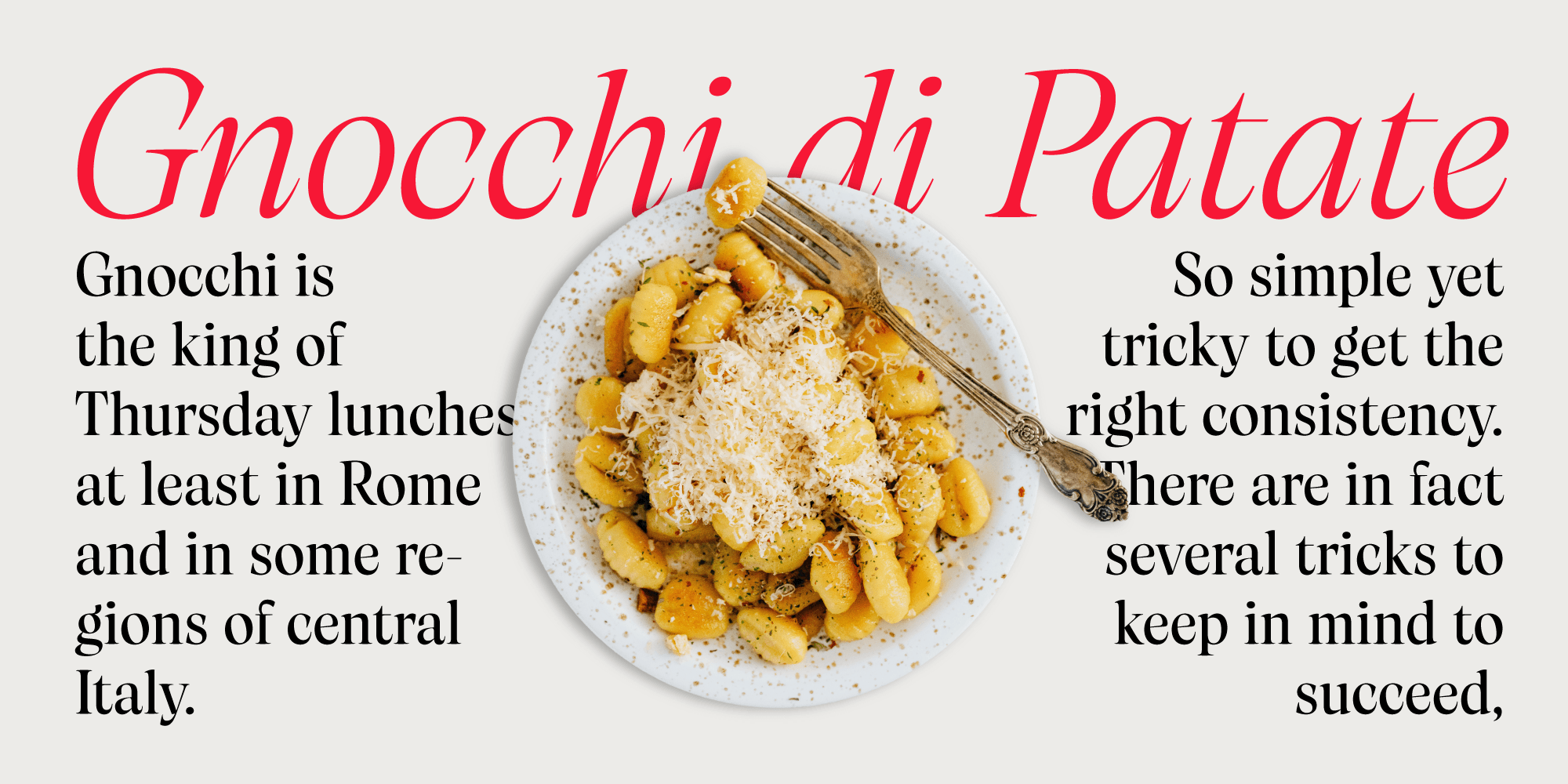
We also delve into historical Italian typographic history from more recent periods, which are fascinating yet lesser-known. For instance, when we designed the typeface Artusi, we collaborated with the Fondazione Pellegrino Artusi to honor the legacy of one of Italy’s first and most famous food writers.
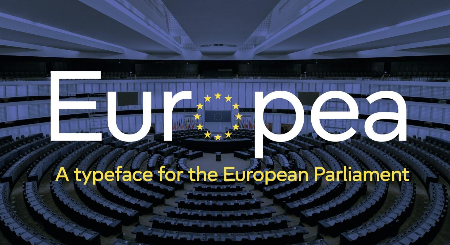
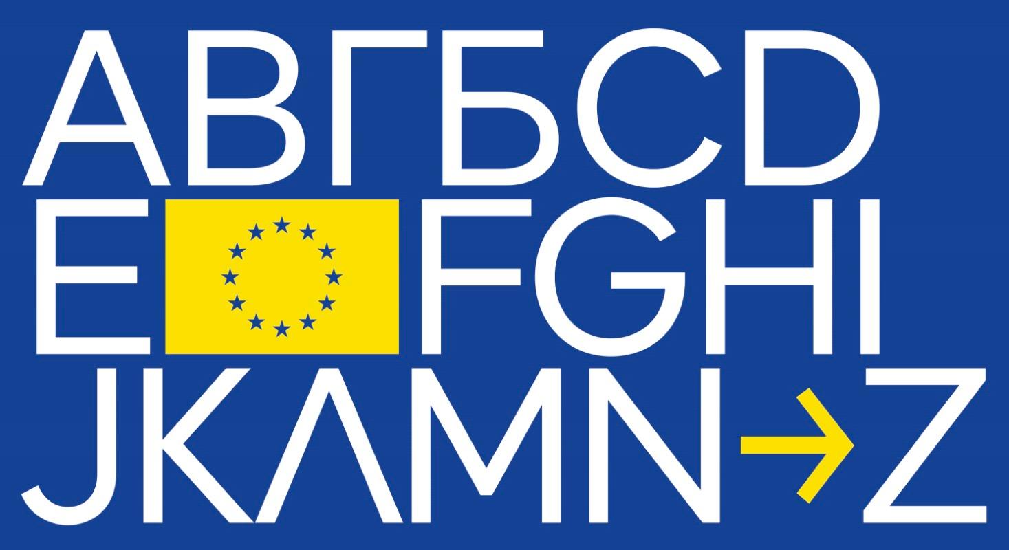
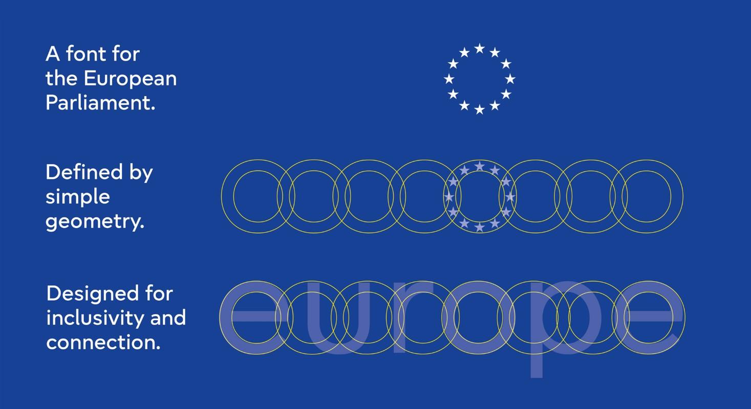
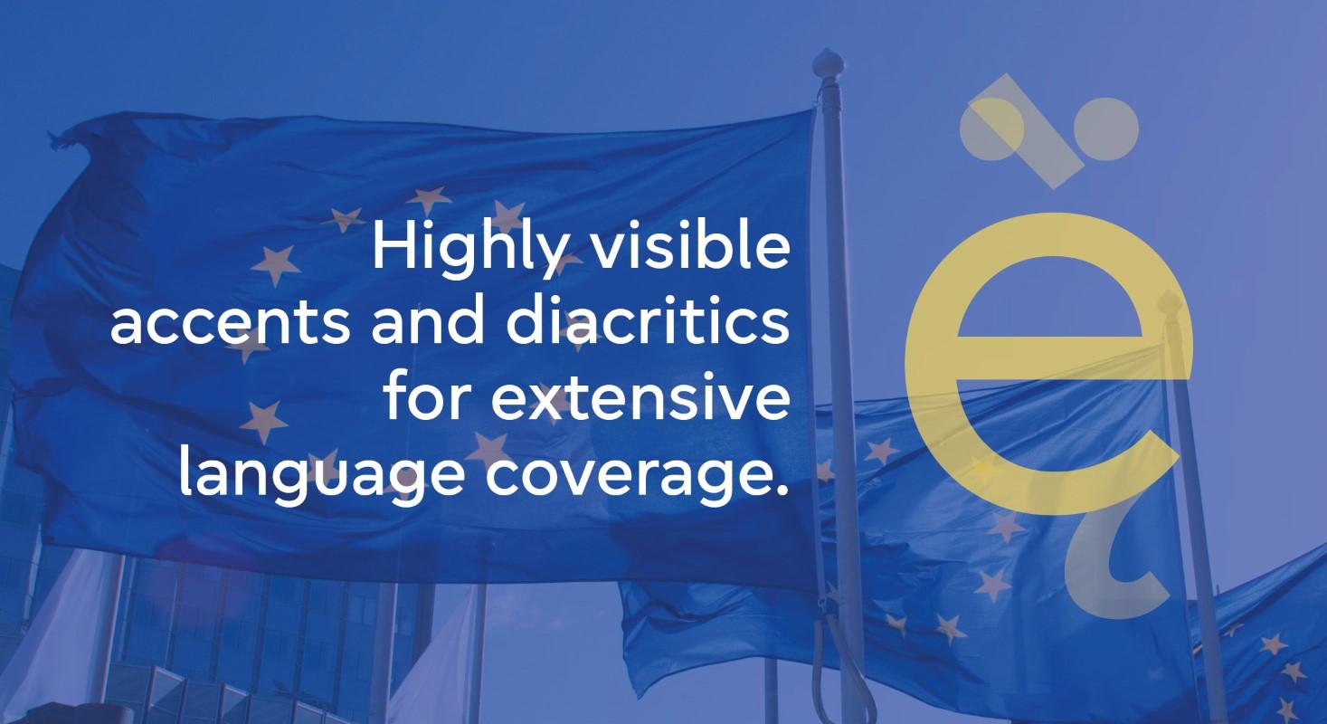
The Europea typeface was created to be the official font in the new branding system of the European Parliament. It was designed by Zetafonts for Tipik Agency, in close collaboration with a core team of over 20 consultants from the EP team, managed by Pietro Naj Oleari.
You offer a range of services from custom typeface design to logo design, character set expansion, and consulting. What is one of your favorite enterprise projects so far?
One of the projects we’re particularly proud of is creating the official typeface for the European Parliament. It allowed us to develop a typeface that respected the intricate diacritics of many European languages. The project had numerous constraints and technical challenges, but it was fulfilling to create a typeface that was both aesthetically pleasing and functionally robust, including an ink-saving version for paper conservation. It was a project that truly highlighted the impact of typography, even as a technical tool.
What makes Zetafonts a good choice for enterprise clients?
Our success is largely due to our nearly two decades of experience in branding and design. When designing typefaces, we view them as tools for graphic design and branding, so we create custom typefaces that solve communication problems for our clients. Our design approach balances contemporary aesthetics with legibility and tradition, and we’re open to working with different cultures, such as expanding our typefaces to include Arabic and Hebrew glyphs. Our goal is to use type as a bridge between cultures, which is an exciting and rewarding aspect of our work.
Could you share the stories behind a few of the typefaces you’re launching on Type Network?
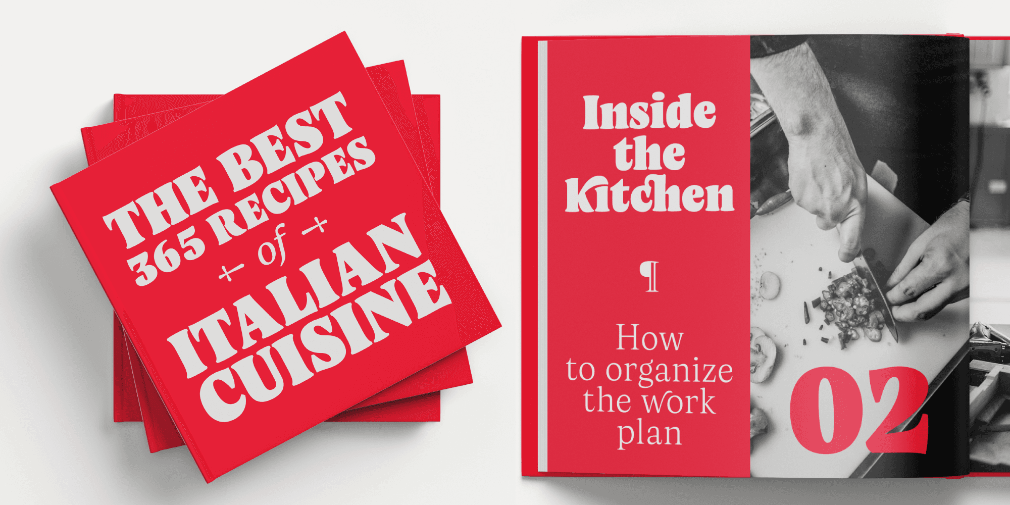
Absolutely. On Type Network, we’re starting with Cocogoose. It’s one of our oldest and most successful typefaces. It’s a geometric sans-serif with a characteristically warm feeling, reminiscent of old printing styles. The slightly rounded corners and larger letter heights give it a friendly and soothing visual rhythm. Despite its formal strength, Cocogoose has a soft approach that doesn’t distance the viewer from the material. Over time, we’ve expanded it into a comprehensive family with text, display, and layered variants, making it a versatile tool.
Another typeface we’re excited about is Milligram. It began as an exploration of Akzidenz Grotesk and Helvetica, but we wanted to step back towards the warmer feeling of the first grotesques, moving away from the colder, more industrial modernist typefaces. Milligram has unique features, like the Macro optical size, where the letters slightly overlap, creating a tight, dark texture. This feature acknowledges standard typeface usage but incorporates it as a design element, allowing for a typeface that is already optimally spaced for tight typesetting.
We’re also launching Artusi on Type Network. Pellegrino Artusi was a celebrated Italian food writer, who is credited with the creation of one of the most influential cookbooks in the history of Italian cuisine. Designed by Francesco, Artusi takes inspiration from Pellegrino’s legacy with both text and display variants. Our intention was to create a typeface that’s versatile enough for titles yet robust in text settings. The design of Artusi reflects a dedication to quality and detail, akin to Italian food culture—it’s about crafting something with attention, love, and warmth.
What does joining Type Network mean for Zetafonts?
Joining Type Network is very inspiring for us. It includes many professionals we admire, like David Jonathan Ross. Being among such giants of our profession is both a joy and a challenge to elevate the quality of our work. Type Network represents an opportunity to reach a broader audience and to create products that are both beautiful and meaningful.
What's next for you and Zetafonts?
We’re continuing to expand our range of typefaces, aiming for wide, versatile families that offer various usage opportunities. We love creating typefaces with extensive design spaces, including extreme display weights and practical text weights. Our focus is on reinventing classics while also capturing new trends. For instance, we’re working on updated versions of Bodoni and Garamond, bringing them into the new millennium with a fresh perspective. Simultaneously, we’re exploring what’s happening in contemporary design, translating those tastes into faces that reflect current zeitgeists.
Are there any final thoughts or additional information you’d like to add before we conclude?
Yes, I’d like to mention our partner initiative, TypeCampus, led by Debora Manetti. It focuses on educational and non-profit activities; one such initiative is Fight for Kindness, which we’ve been building over the past two years. Our research on type trends is also part of TypeCampus’s work. We believe that our commercial work should be supported by cultural research and educational activities to create a powerful and meaningful community.
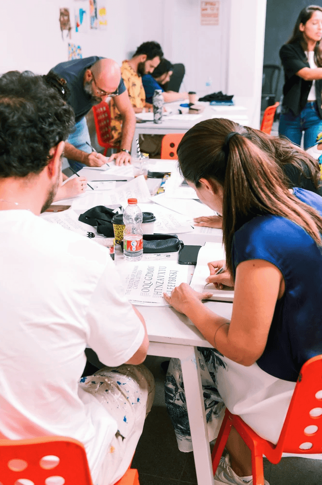
Zetafonts presents and leads type design workshops internationally: This photo was taken during OFFF Tel Aviv, 2022.
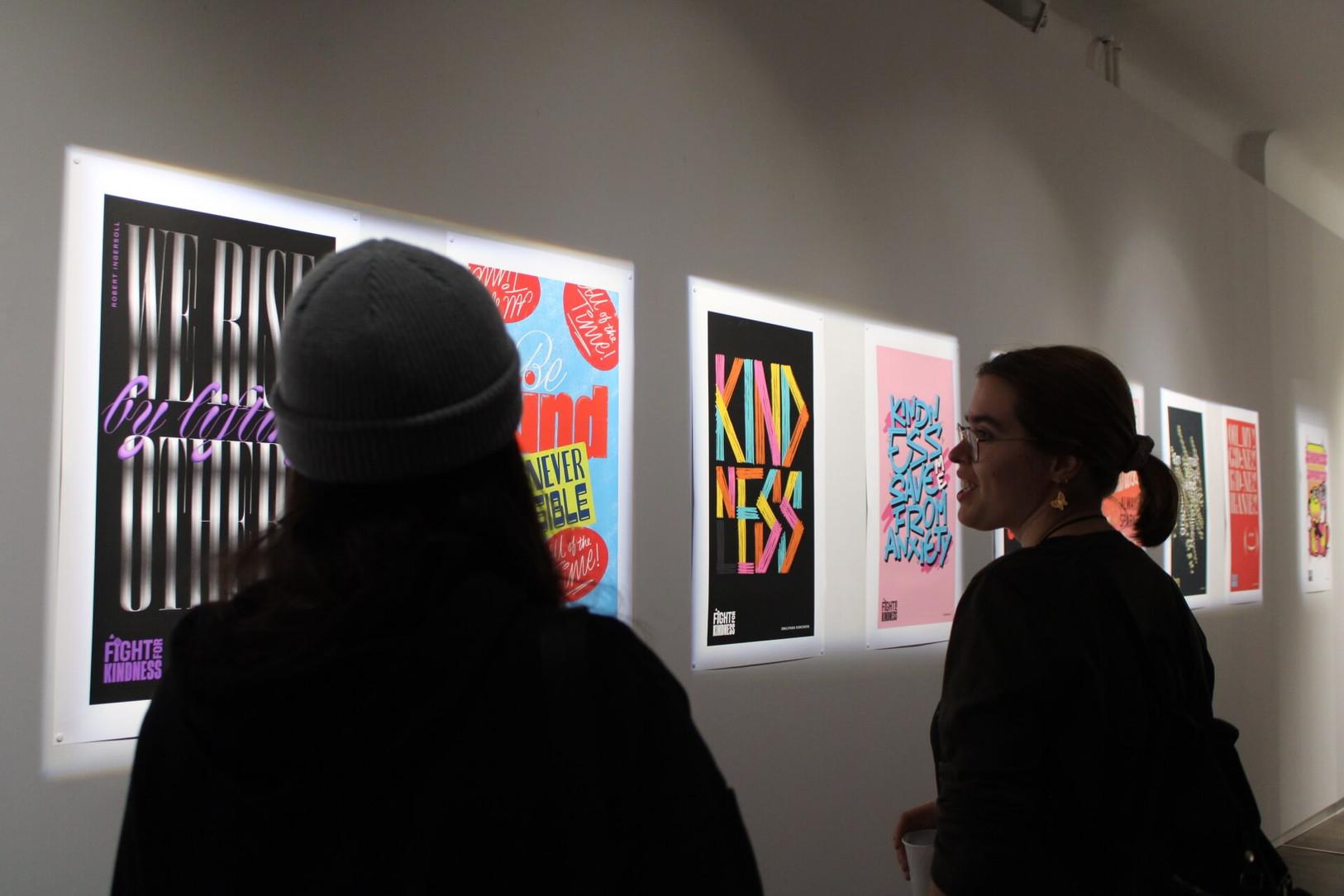
The TypeCampus initiative Fight for Kindness produces an annual traveling poster exhibit. Here, we see it at the House of Lucie in Budapest.
It’s impressive to see a type foundry engaged in such a wide range of activities. You and your team are making a unique impact in the design world.
It’s a lot of work, but it adds meaning to the typefaces we create. Research, like our current projects on Latin, Arabic, and Hebrew glyphs, allows us to view global developments from a cultural perspective. We’re collaborating with designers from Israel and Palestine to create typefaces that can build cultural bridges. It’s a small step, but these efforts feel important in adding purpose to our work.
That’s wonderful. It was great meeting you, and I’m excited to see Zetafonts as a part of Type Network.
Thank you very much.
Zetafonts finely designs high quality retail typefaces and provides custom font design services for commercial and institutional clients worldwide.
Cocogoose, Artusi, and Milligram can be licensed for print, web, mobile apps, and ePubs. Webfonts may be tested for thirty days, and desktop trials are available upon request. Have a licensing question? Check out our support page or get in touch.