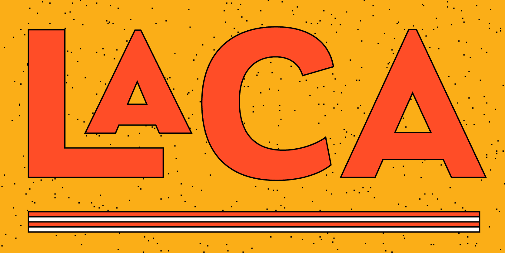
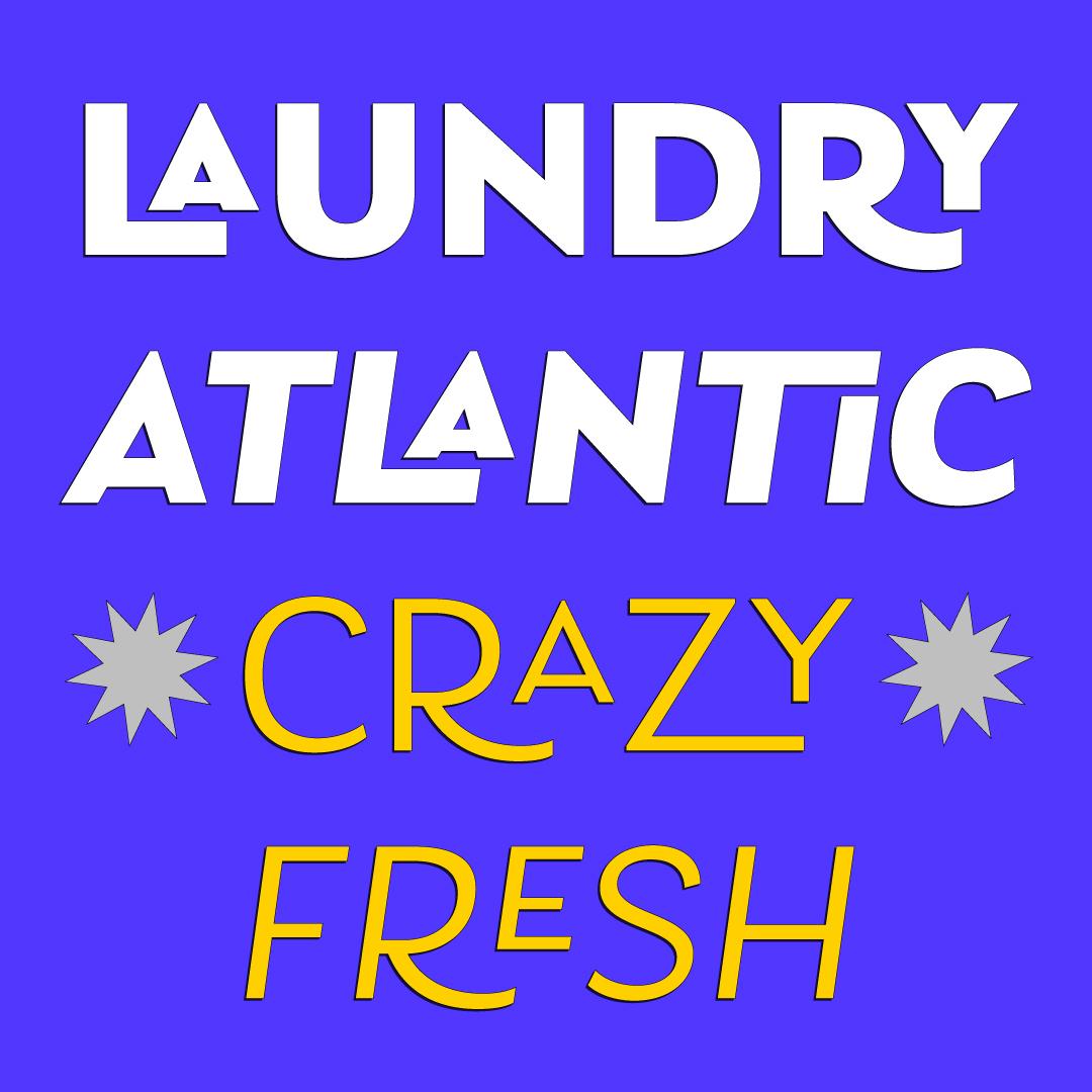
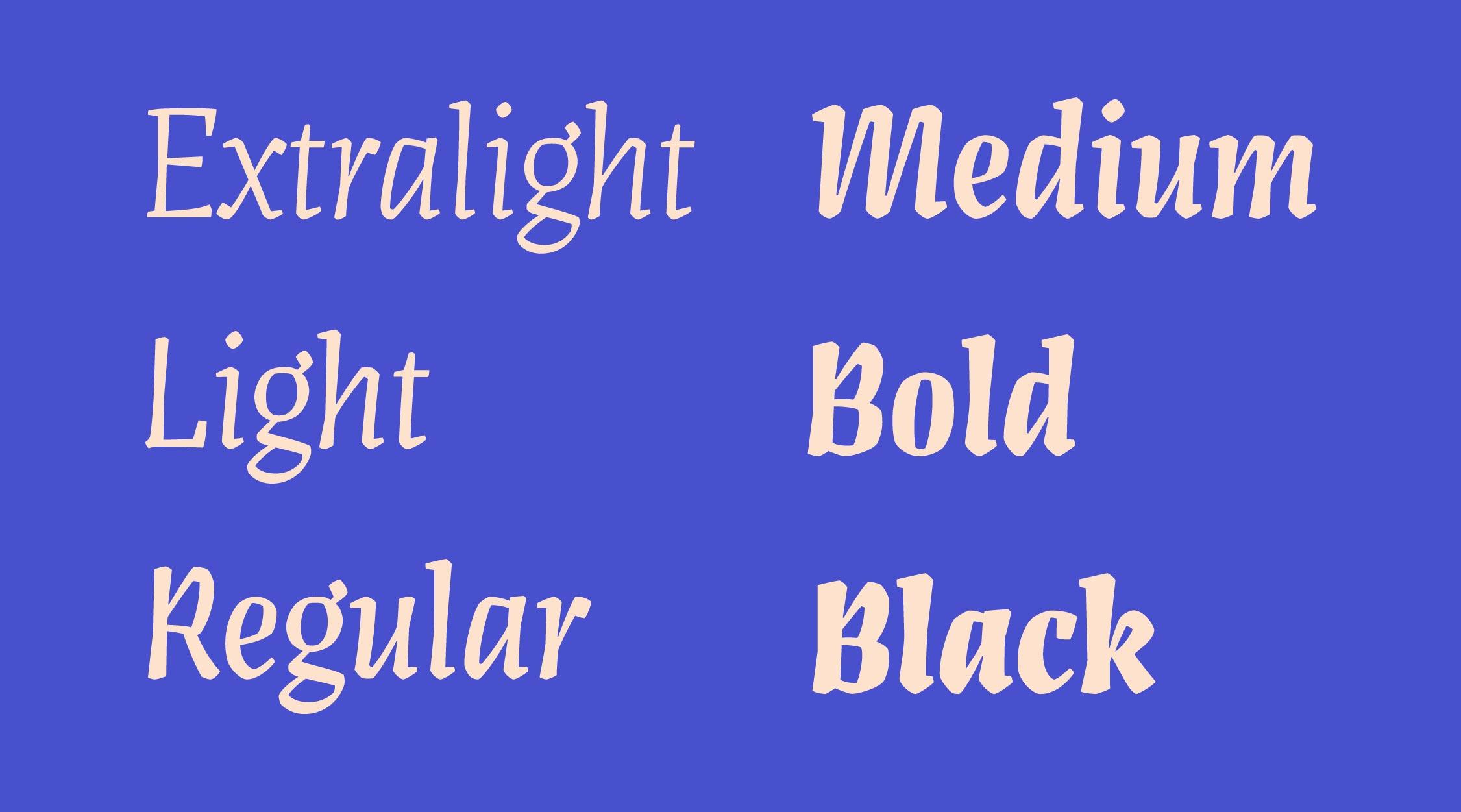
Typefaces Artigo Display, Laca Pro, and Anona show the stylistic range of Nova Type.
Nova Type: A fresh solo endeavor
Tell me about your path towards creating your own foundry, Nova Type.
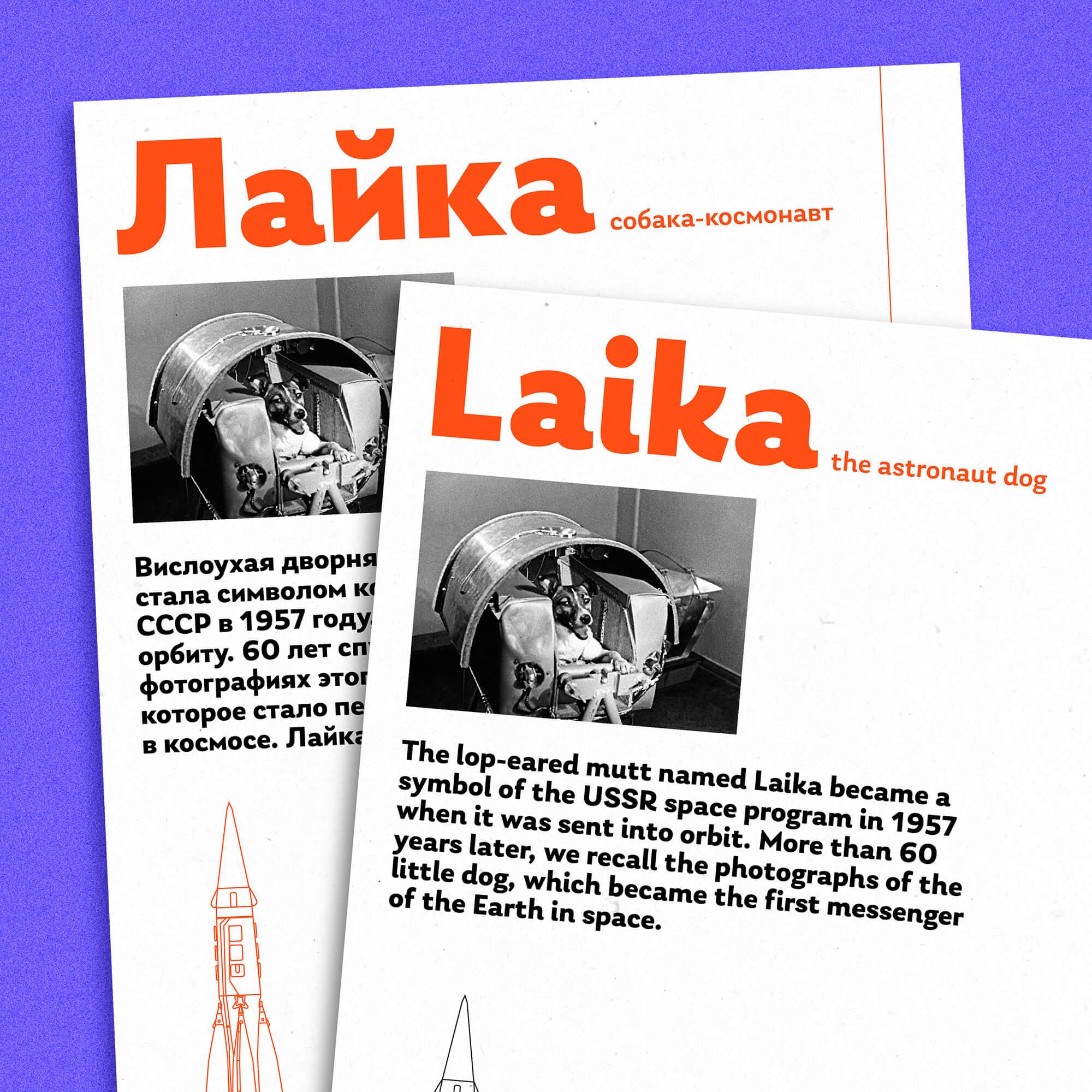
The early days were a mix of excitement and learning. Working with Eben Sorkin was an invaluable experience that taught me the nuances of type design. Starting with Google Fonts opened up new avenues, leading to collaborations with Indian Type Foundry, among others. The transition to starting a company felt natural as projects grew in scale, especially with non-Latin scripts. The founding of Nova Type Foundry marked a new chapter, focusing on both custom projects and expanding our font offerings. It was a significant shift, but one that allowed me to dive deeper into type design, exploring Cyrillic, Greek, and other scripts, all while focusing on growing the foundry.
Many font companies are run like a mere business machine, but our aim at Nova Type is to be an independent font foundry that cultivates creativity, collaboration and education.
You’ve designed typefaces in many different scripts over the years. Where is your focus now?
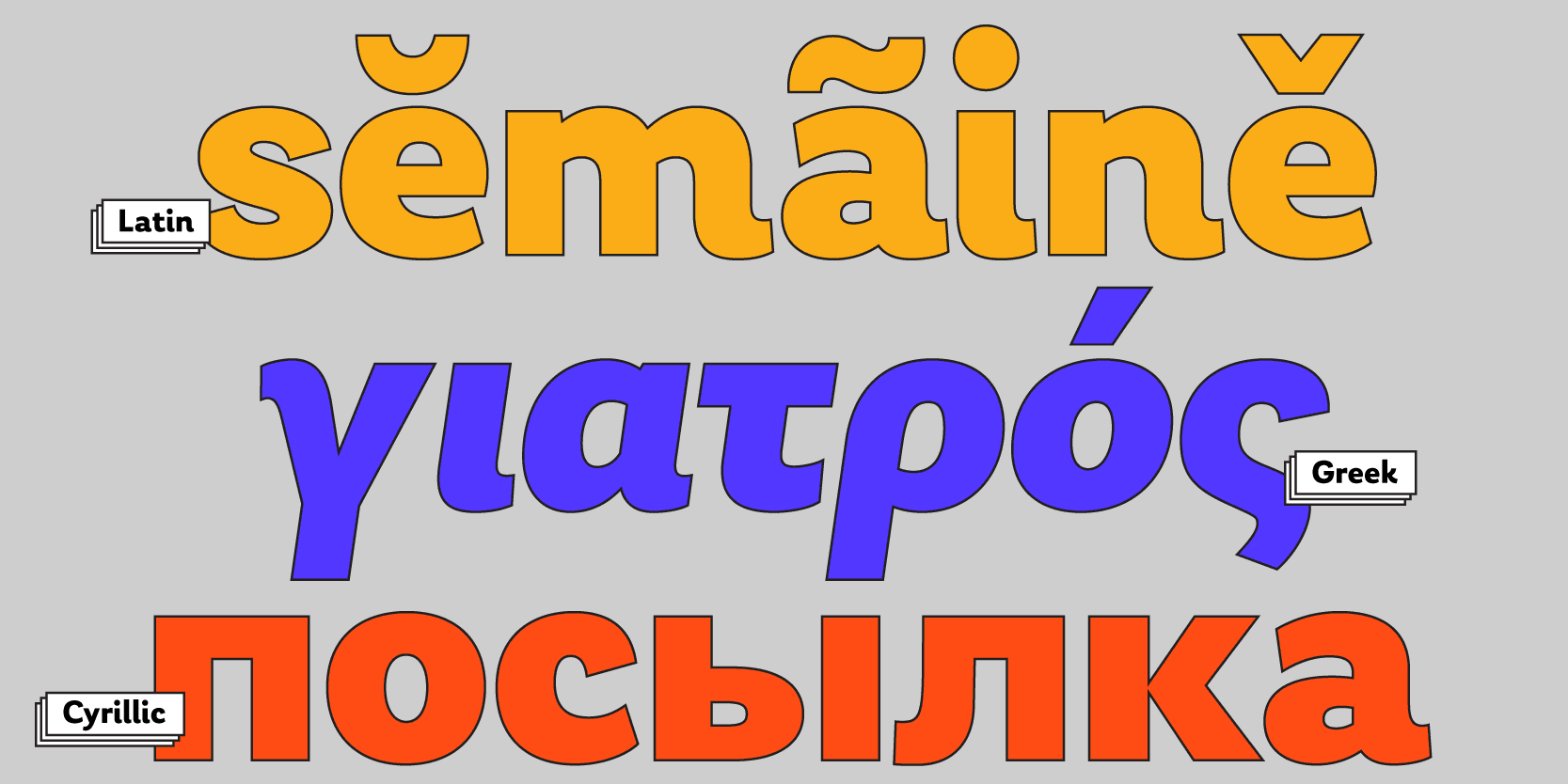
The decision to include a given script is influenced by market needs and the practical aspects of a design. While early projects with Google allowed me to explore Tamil and Devanagari, my recent focus has been on Latin scripts due to their broad commercial appeal and my own expertise. The landscape of type design is vast, and while non-Latin scripts offer fascinating challenges, the depth of specialization required means I’ve chosen to concentrate on areas where I can offer the most impact and quality.
Your decision to focus primarily on Latin scripts in your custom work indicates a strategic pivot in your career. How do you feel about this shift, especially considering your earlier work with global scripts?
Focusing on Latin scripts has been a natural progression for me. While the complexity and richness of non-Latin scripts are fascinating, dedicating time and resources to Latin allows me to hone my craft and produce work that feels both personal and impactful. It’s a domain where I feel my expertise can truly shine, contributing to the broader design community in a meaningful way.
The typefaces you’re launching on Type Network—Anona, Artigo Display, Laca Pro, and Lemongrass—showcase a wide range of styles and complexities. How do you decide what to design next and how to expand Nova Type Foundry’s library?
It’s always a mix of personal interest and market interest. I create designs that I want to create, and which I believe will resonate with designers.
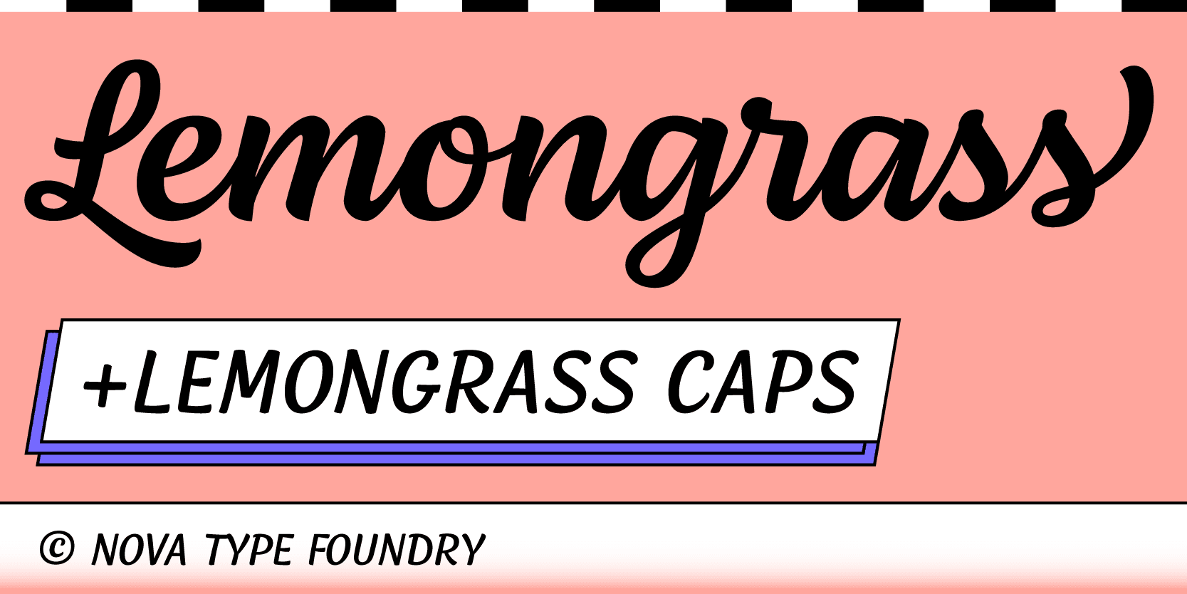
It’s quite amusing that Lemongrass, despite its simplicity, contains such complexity. It’s densely packed with variations and connections, all meticulously considered, making it a labor-intensive project condensed into just two styles. Yet, it has become one of my top sellers.
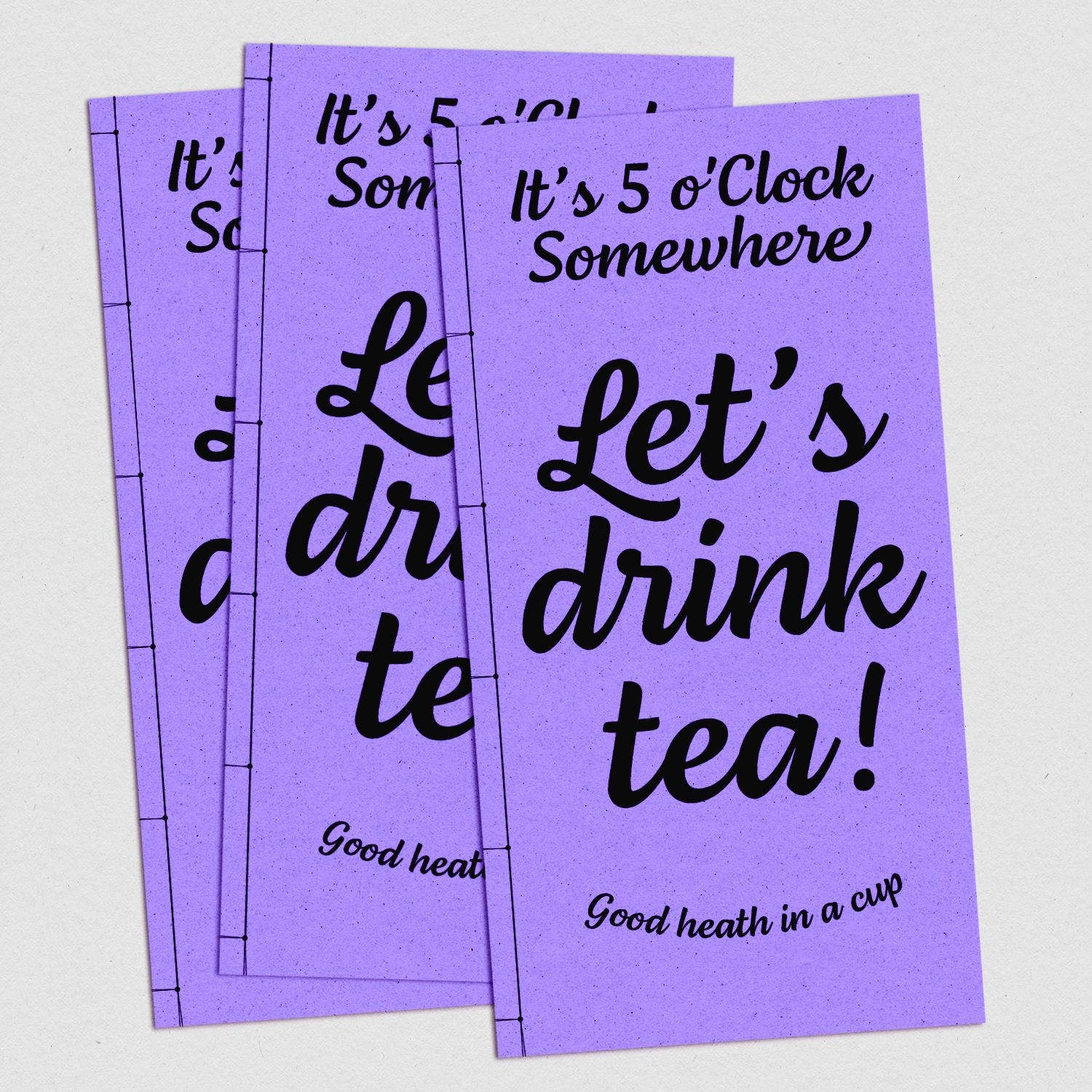
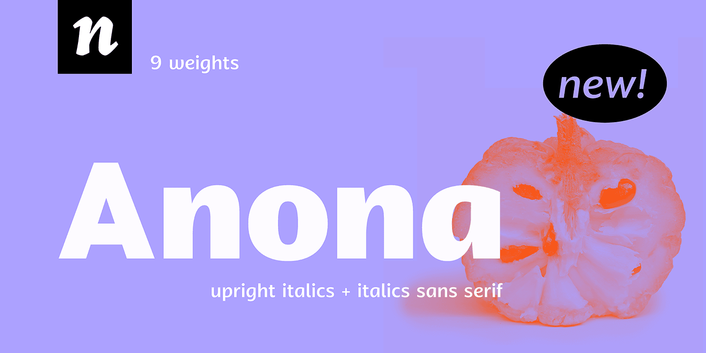
I designed Lemongrass because I wanted to make a script that I loved, personally. That’s the essence of being a type designer—pursuing projects that spark our passion. Meanwhile, Anona came from a different angle. It’s a humanist sans, which let me design a wider spectrum of weights. It was a more complex and larger project.
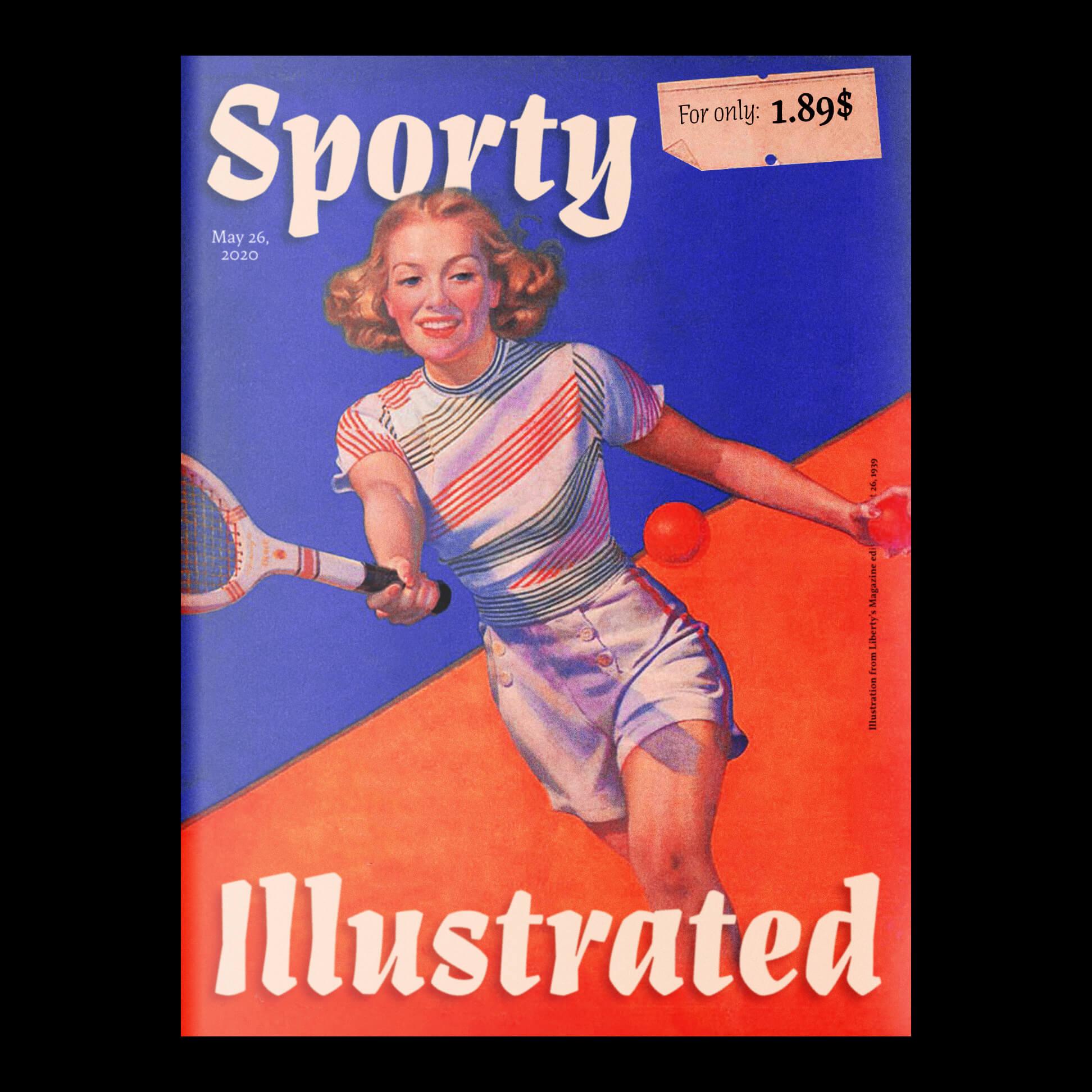
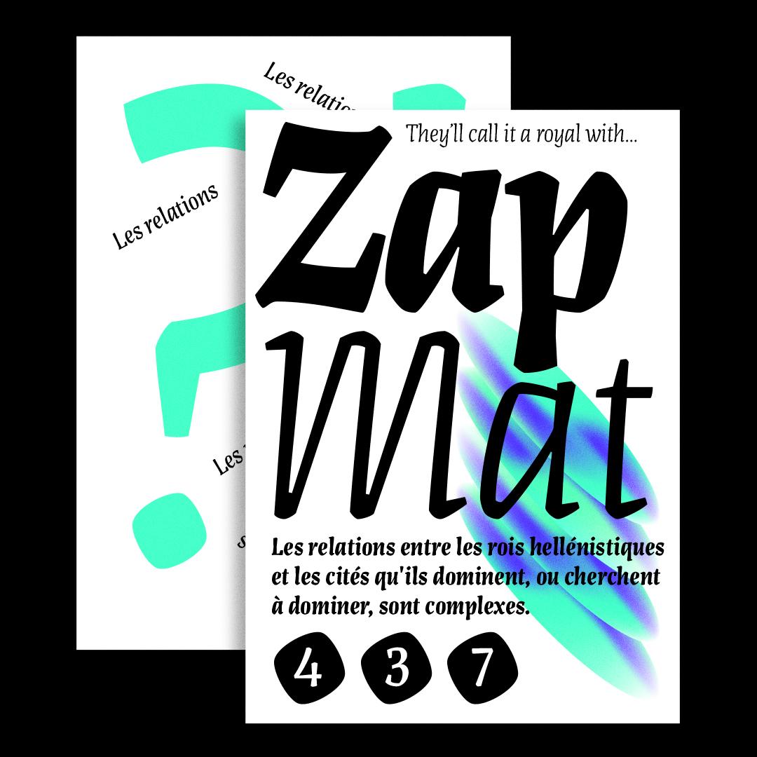
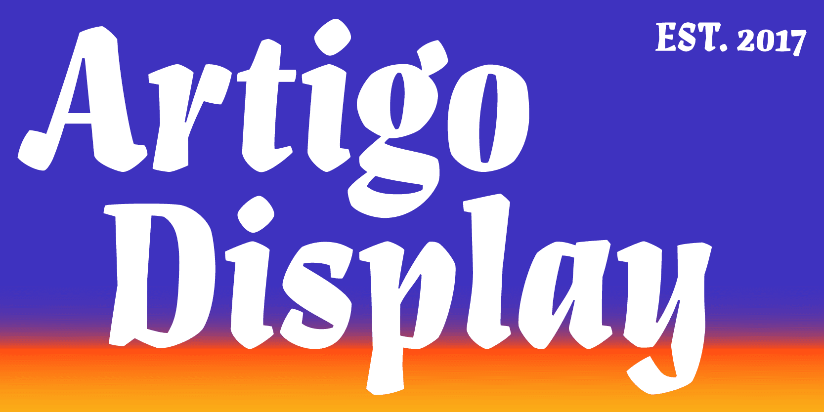
Artigo Display, on the other hand, began as a single, bold display style, eventually expanding to offer a few more weight variations to enhance its versatility across various sizes. Yet, what truly matters to me across all these projects isn’t the scale, the number of weights, or their complexity. It’s about the design’s soul, its character, and personality. These fonts are expressions, meant to convey ideas through their unique voices.
Even with larger families like Laca Pro and Anona, I strive to infuse them with distinctive styles and personalities, ensuring they offer more than just a straightforward sans experience. Each font, regardless of its scope, is a testament to this philosophy, aiming to enrich the design landscape with its unique presence and expressive potential.
Speaking of Artigo Display, can you share more about the creative process behind the typeface?
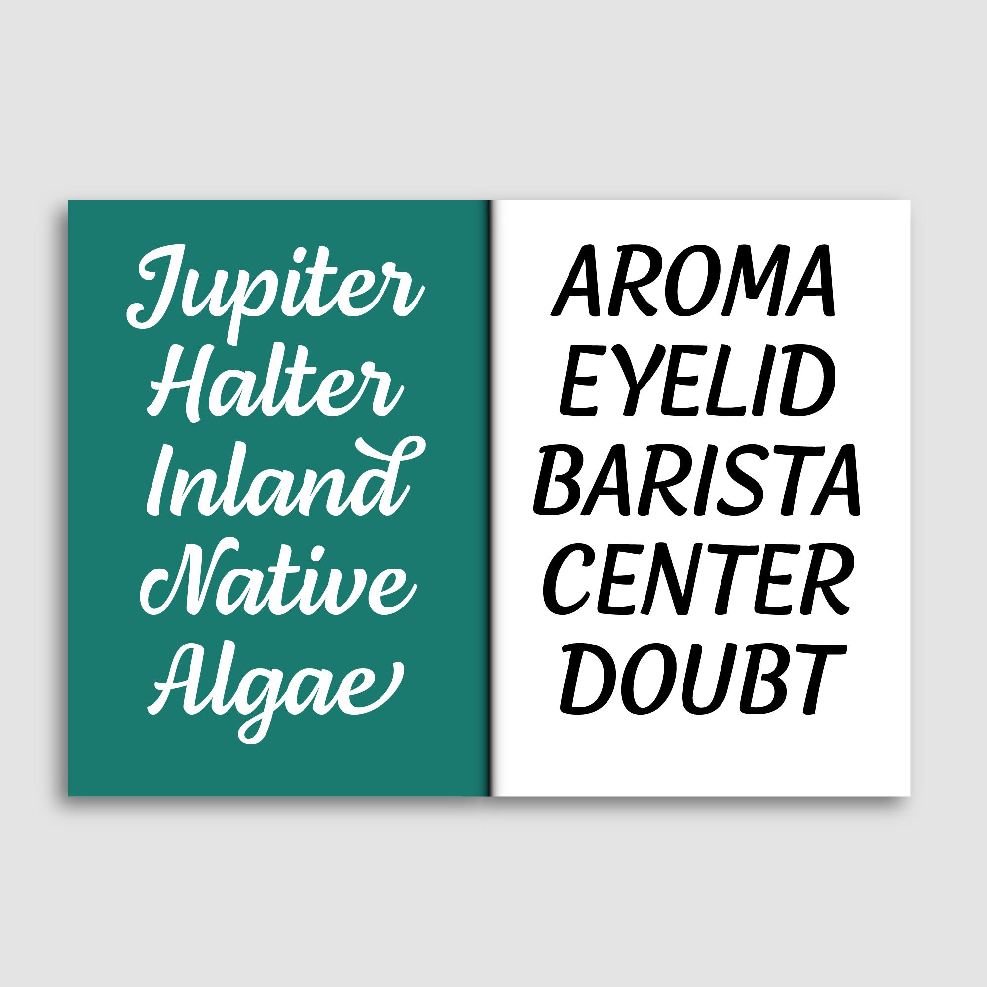
I wanted to push the boundaries of type design. Inspired by blackletter and calligraphy, Artigo Display came from an exploratory process to combine digital precision with hand-drawn warmth. The challenge was to maintain a coherent style across its different weights.
You’ve mentioned the importance of character and personality in your typefaces. How do you ensure each font you create reflects a unique voice or style?
I spend considerable time researching, sketching, and experimenting with forms to capture a specific mood or character. For instance, Lemongrass was about creating something personal and expressive, which required delving into the subtleties of script forms. Meanwhile, Anona was an exploration of humanist sans qualities, aiming for warmth and readability. Each project starts with a clear concept that guides its development, ensuring its personality shines through.
Reflecting on your journey from architecture to type design, how has your background influenced your approach to type design?
My architecture background has profoundly influenced my approach to type design, especially in terms of structure, precision, and attention to detail. Architecture taught me the importance of foundation and form, which I apply to the construction of letters. The transition to curves and the exploration of form in type design felt like a natural extension of architectural principles, allowing me to explore design in a more fluid and dynamic way.
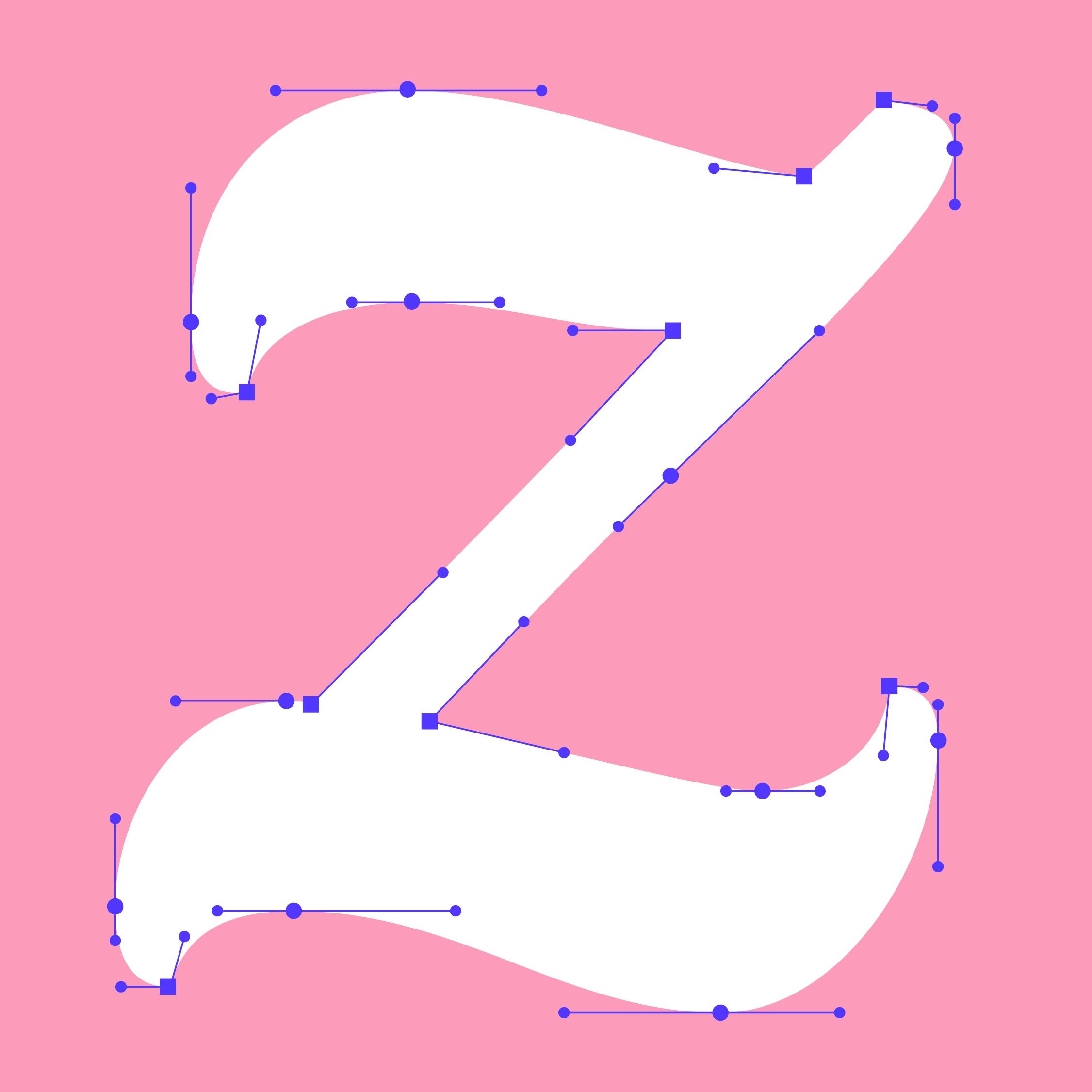
Across the six weights, Artigo's style stays consistent and coherent.
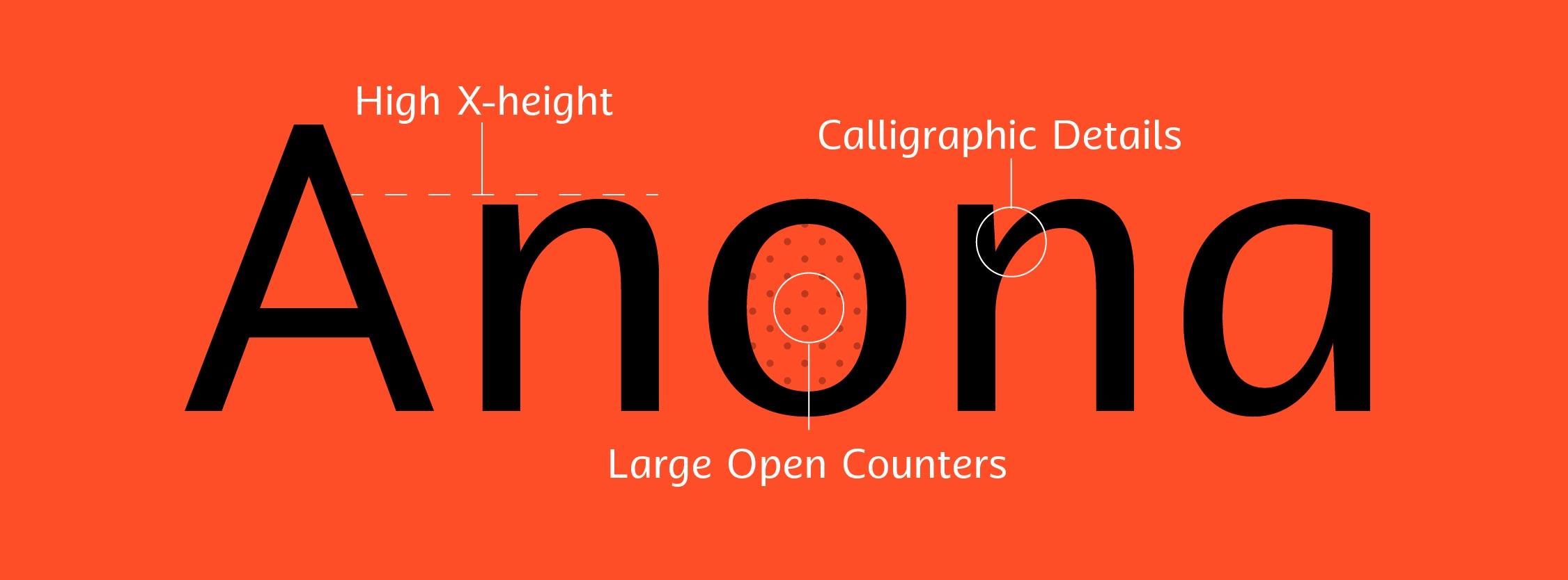
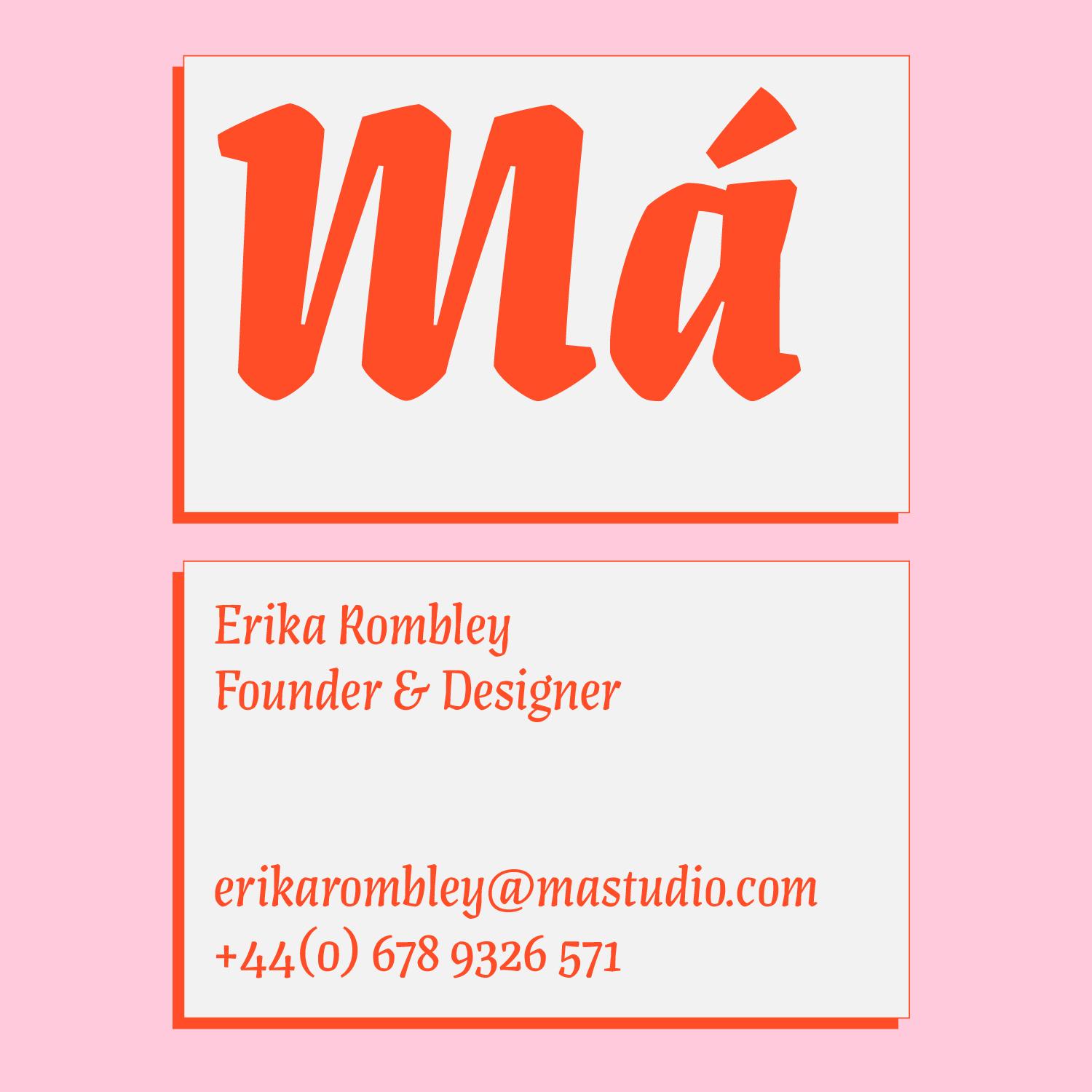
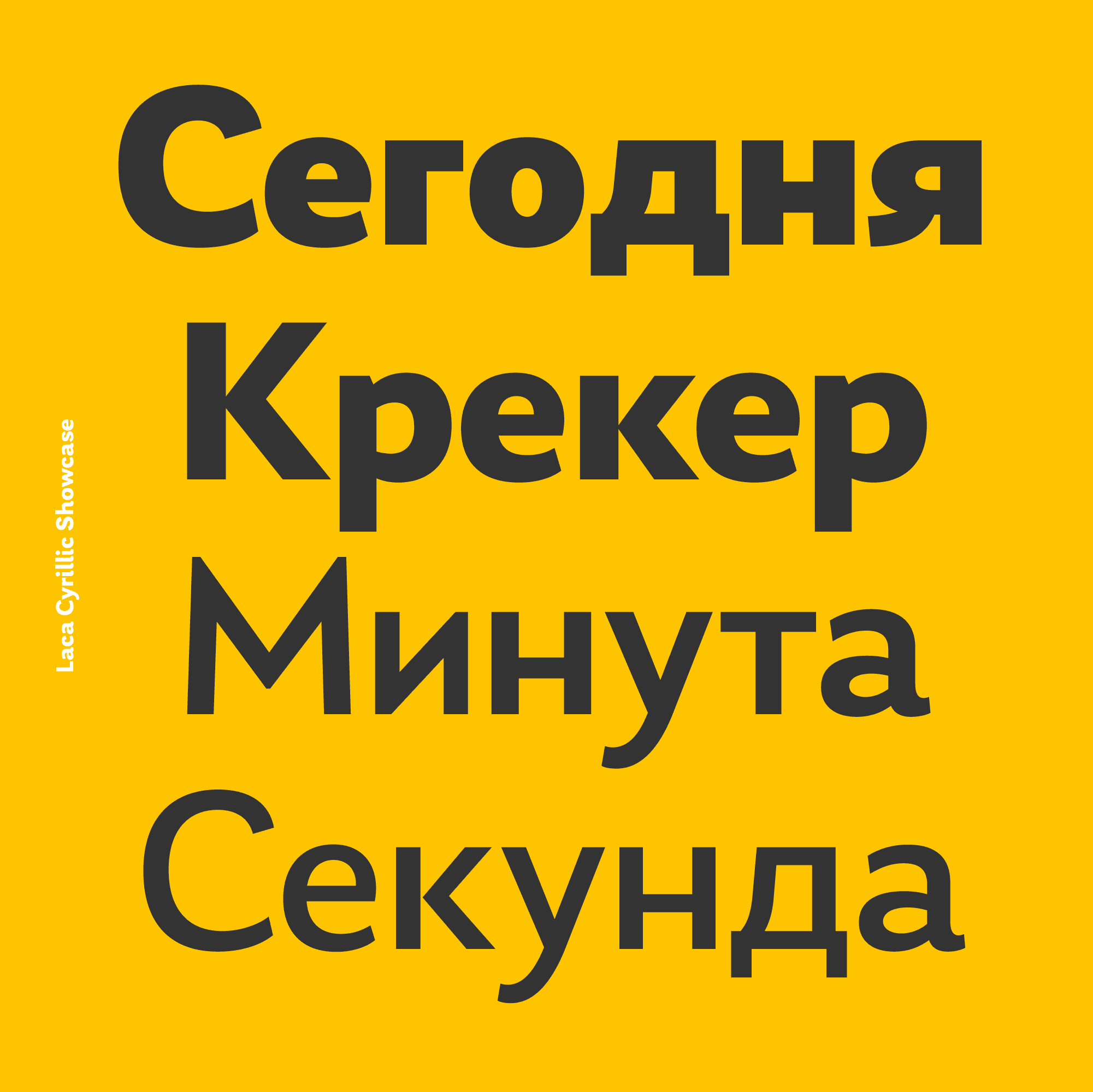
Influenced by humanist sans, Anona has the friendliest qualities while remaining legible and refined.
What’s the significance of joining Type Network for you and Nova Type Foundry?
Joining Type Network is a milestone for Nova Type Foundry. It’s not just about gaining recognition; it’s about being part of a community that values quality, innovation, and diversity in type design. It offers an opportunity to reach a wider audience and engage with a global design community. For a small foundry like mine, being featured alongside industry giants is incredibly affirming and motivates me to continue pushing the boundaries of type design.
Looking ahead, what’s next for Nova Type Foundry? Any exciting projects or directions you’re exploring?
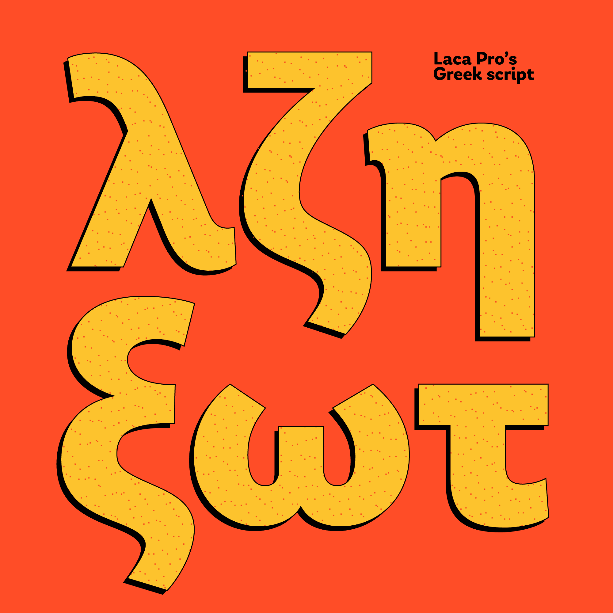
I’m currently exploring more expressive and challenging projects, such as expanding script typefaces and delving into more complex design briefs. Each new project is an opportunity to experiment and grow, and I’m particularly interested in further exploring the intersection of script and sans serif styles. Additionally, expanding the language support for our existing typefaces, like Anona, to include Cyrillic and Greek, is a priority to make them more versatile and globally accessible.
You do a lot of custom work and consulting. How does your approach differ between doing a project for a client and creating your own retail font? Aside from the fact that retail fonts allow you to explore whatever interests you.
Yes, it’s completely different. However, I genuinely enjoy working with others, being part of a team, and collaborating on projects. That’s probably why my library hasn’t expanded quickly—I often take on projects because I appreciate the collaboration and don’t want to work in isolation. I enjoy bringing different skills to various projects, which requires a sharp focus.
Most of my client work is through subcontracting. Currently, I’m working with Google, which in a way is like working directly with a client. For me, the collaboration aspect is significant. It’s an opportunity to learn new skills and technologies, which can be challenging on your own. Learning from others is invaluable.
That’s great. Is there anything else you’d like to add or make sure we include in our discussion?
It’s important to highlight the essence of my foundry. It’s about being a solo endeavor aiming to create something unique—perhaps not entirely new but definitely fresh and expressive. Being based in Portugal might seem irrelevant, but it’s quite the opposite. Portugal is a small country, and being distant from the major hubs can make it challenging to gain visibility. That’s why being part of the Type Network is crucial for me; it significantly increases the chances of people discovering and using my fonts.
That’s absolutely true. Not to be taken for granted. Thank you for sharing your time with me, Joana.
Thank you, Lucas! Glad to be on Type Network.
Artigo Display, Laca, Anona and Lemongrass can be licensed for print, web, mobile apps, and ePubs. Webfonts may be tested for thirty days, and desktop trials are available upon request. Have a licensing question? Check out our support page or get in touch.